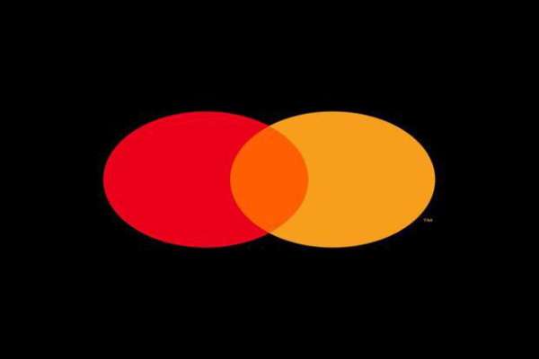
Mastercard logo will no longer have its name, just colours

What’s in a name?
For MasterCard, not enough to keep it in the logo.
The company is removing the word Mastercard from the pair of interlocking red and yellow circles where it has resided for more than 50 years.
Mastercard Inc. joins a small stable of brands like Nike, Apple, and Target that rely on an image and not a name in most marketing materials.
“A picture communicates better than words,” said Allen Adamson, co-founder of the marketing strategy firm Metaforce. “And they have the distinct advantage of having one of the most recognizable icons in the world.”
The Purchase, New York, company said Monday that 80 percent of people recognize the Mastercard logo even when its name isn’t present.
It also points to the changing nature of exchanging currency. One of the original major credit card companies, formerly known as Master Charge, Mastercard has attempted to rebrand itself in recent years as a “technology company in the global payments industry.”
Adamson said the new wordless logo is a reflection of the tech-centric world we live in.
“Evolving the logo into an app-like icon also fits in line with how younger consumers are connecting to the world around them,” Adamson said.
Mastercard’s announced changes, as with many corporate re-branding campaigns, also has its skeptics.
“I do not think it is yet iconic enough to successfully execute this new identity, but over time, they will learn if it was a mistake,” Pace University marketing professor Larry Chiagouris said, adding: “Which I think it is.”
This story has been published from a wire agency feed without modifications to the text. Only the headline has been changed.
Courtesy by : Daily Hunt


